VOID

Merging into Emptiness

BRANDING

WEBSITE DESIGN
PRODUCT DESIGN

SAAS PLATFORMS
TFT INTERFACES
PACKAGING MEDIA


Concept & Inspiration:

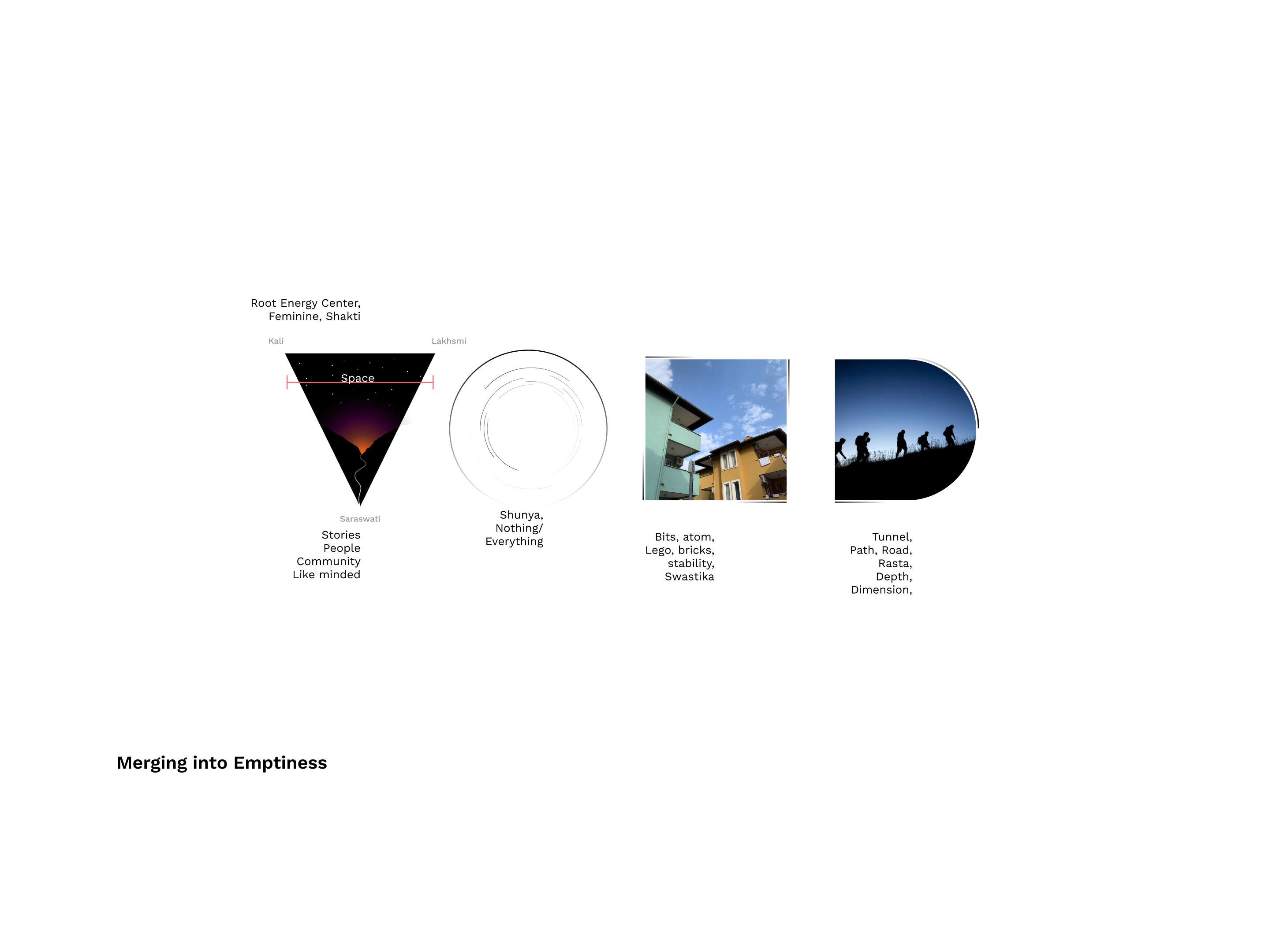
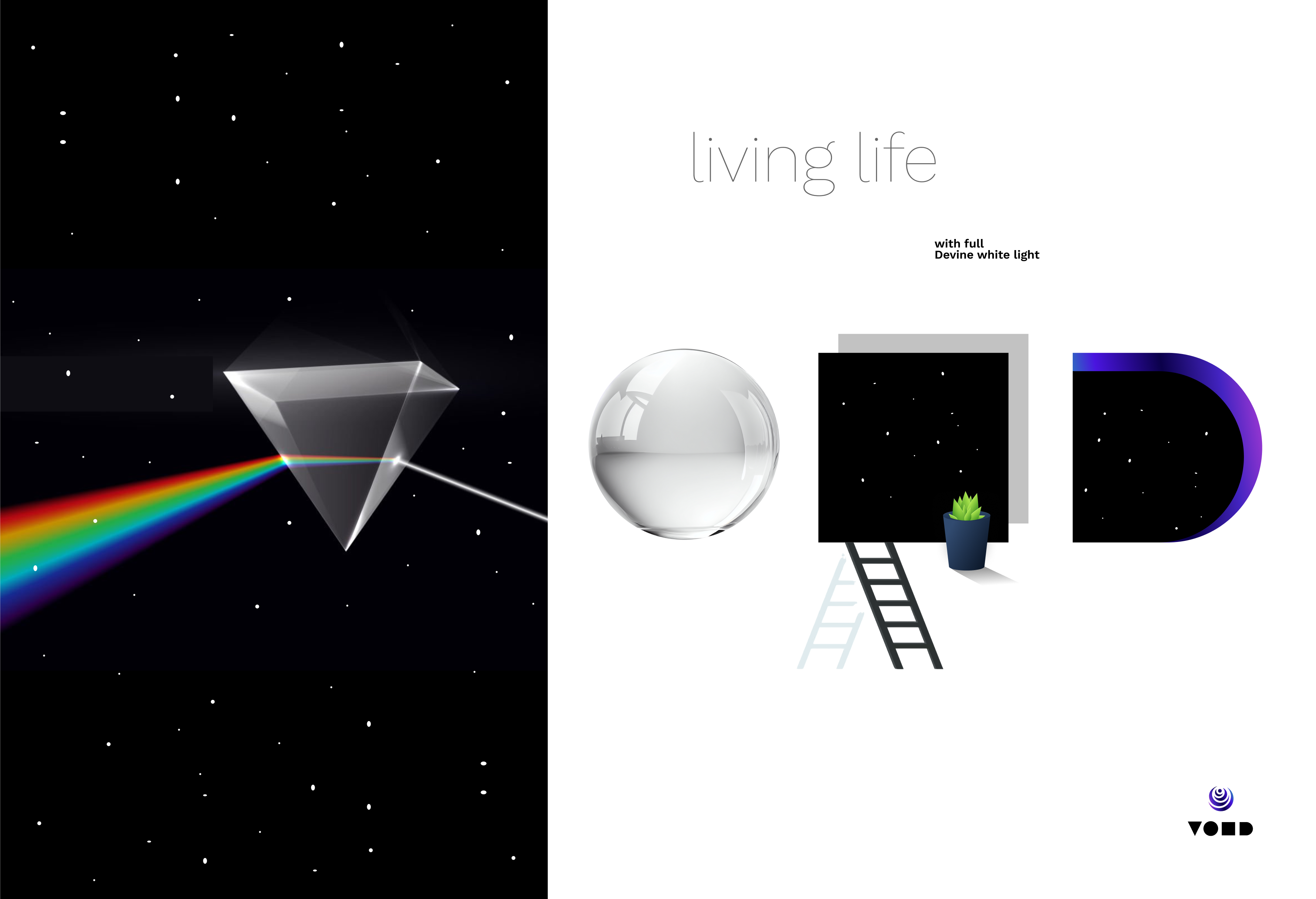
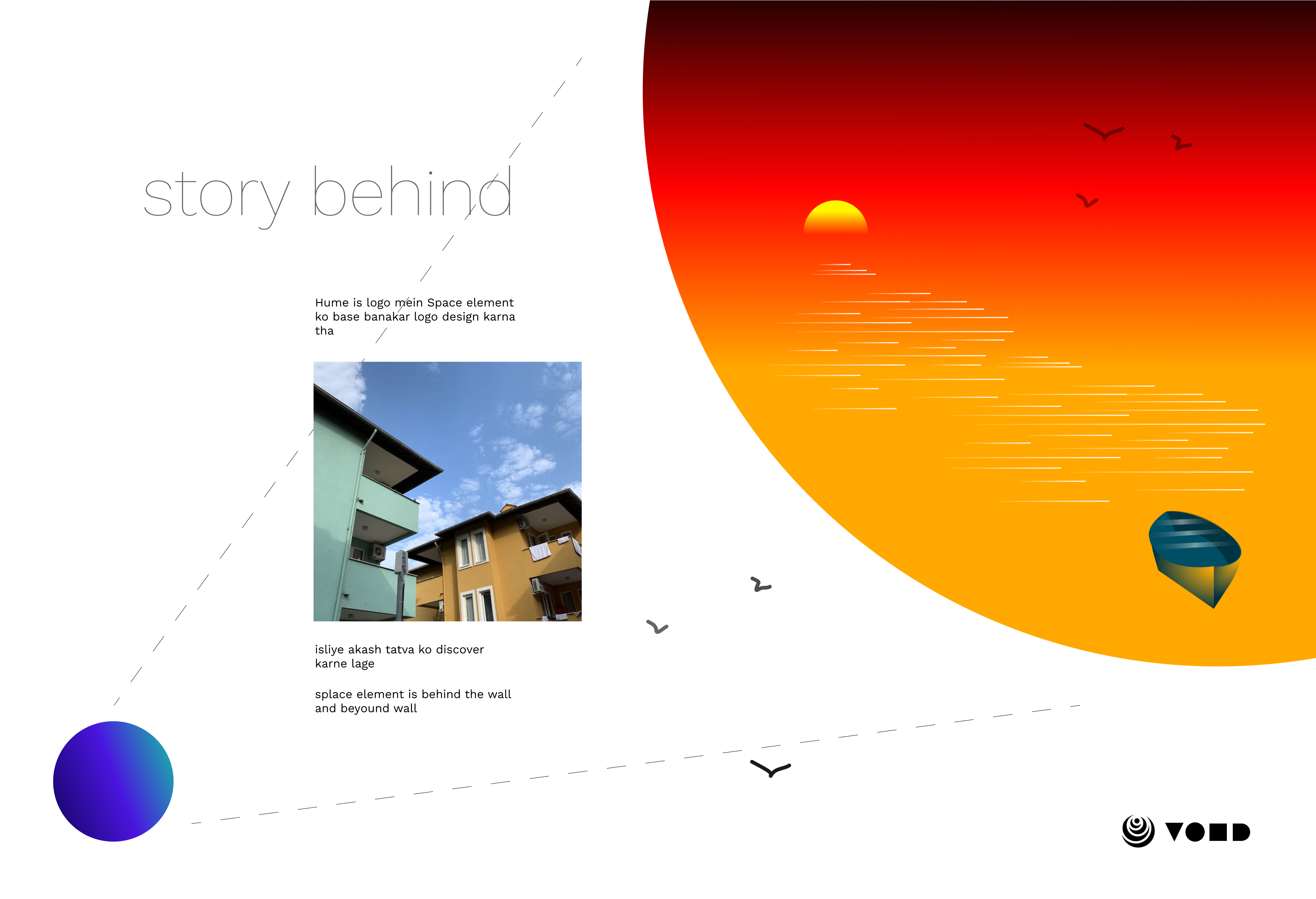
Designed as a visual embodiment of the Space element (Akash)—the essence of existence—the VOID logo captures the balance between form and nothingness. Rooted in cosmic philosophy, it harmonizes feminine and masculine energies, embracing the equilibrium between creation and ascension. The triangle, an ancient symbol of power, serves as the foundation, representing transformation and infinite potential.

Symbolism & Design Breakdown:

Each letter is crafted with intentionality, channeling the essence of emptiness and depth:


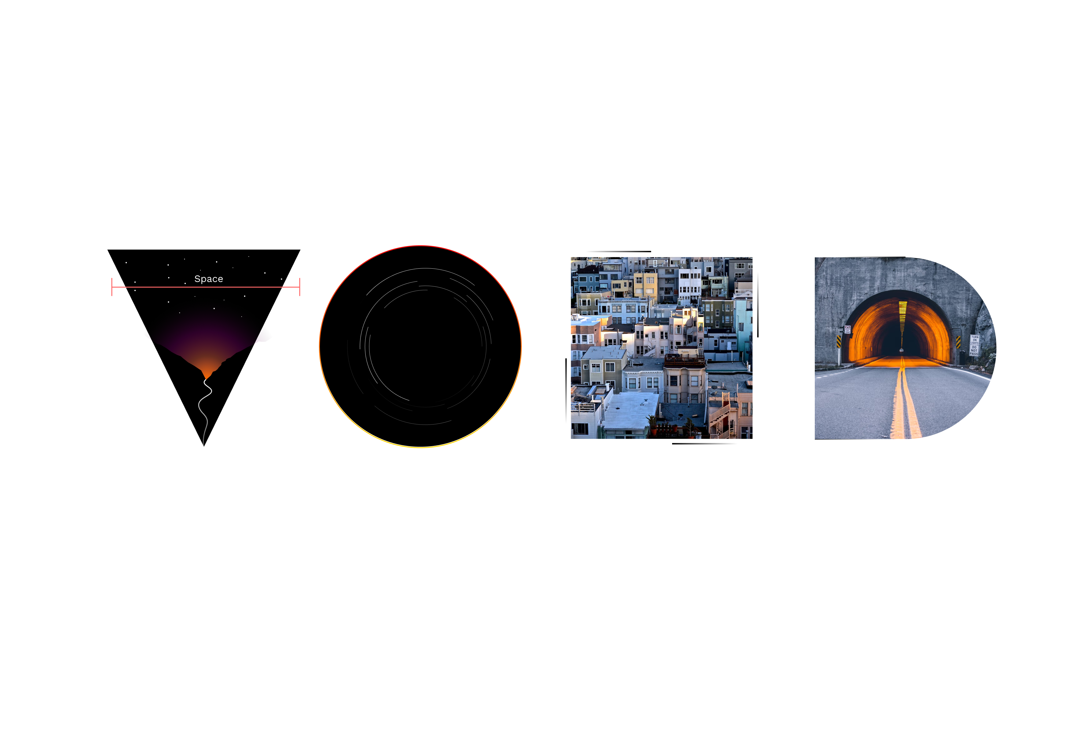
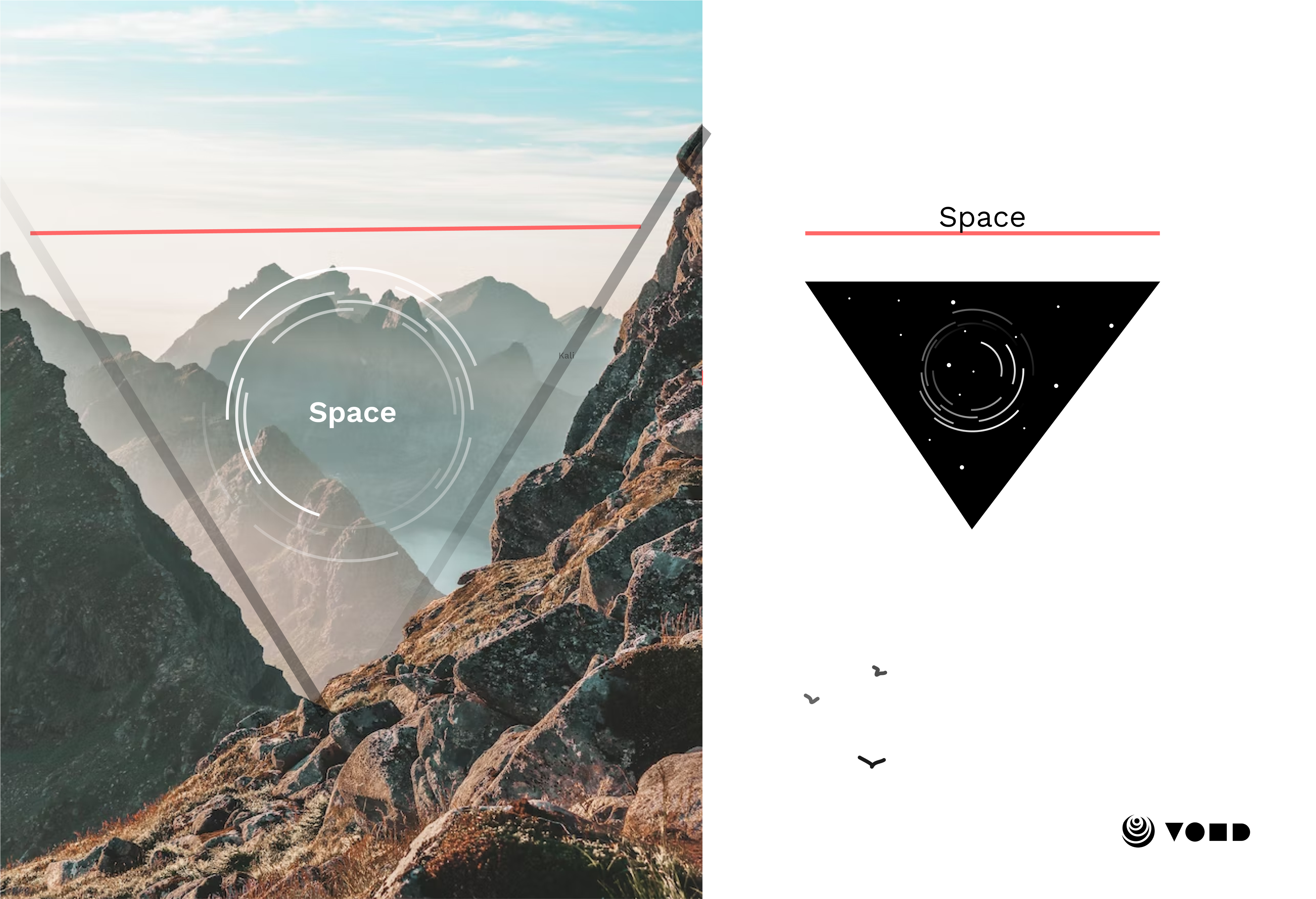
  • V – Formed by the negative space between two mountains, symbolizing balance and duality.

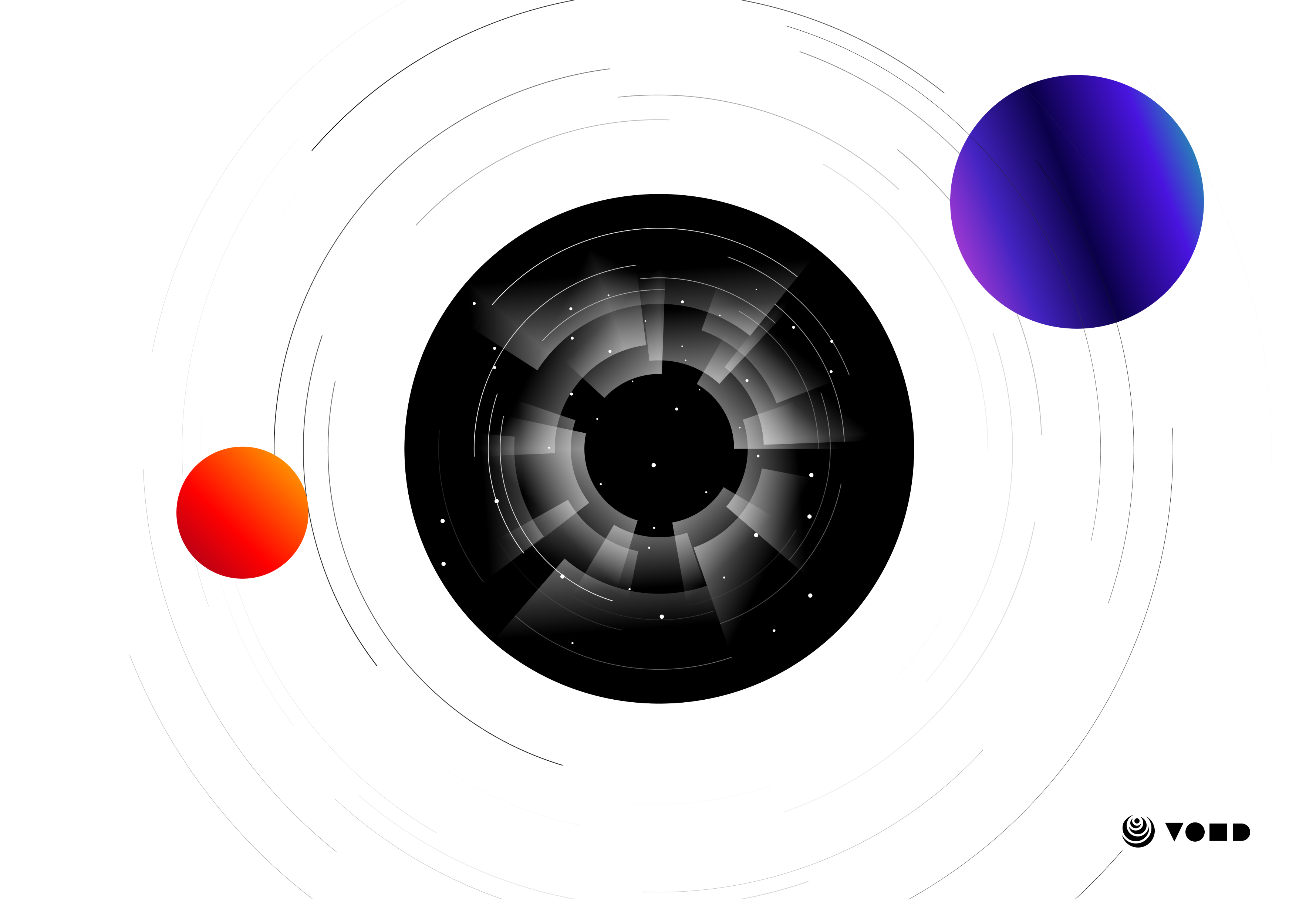
  • O – Represents a black hole, infinity, and the boundless nature of space.
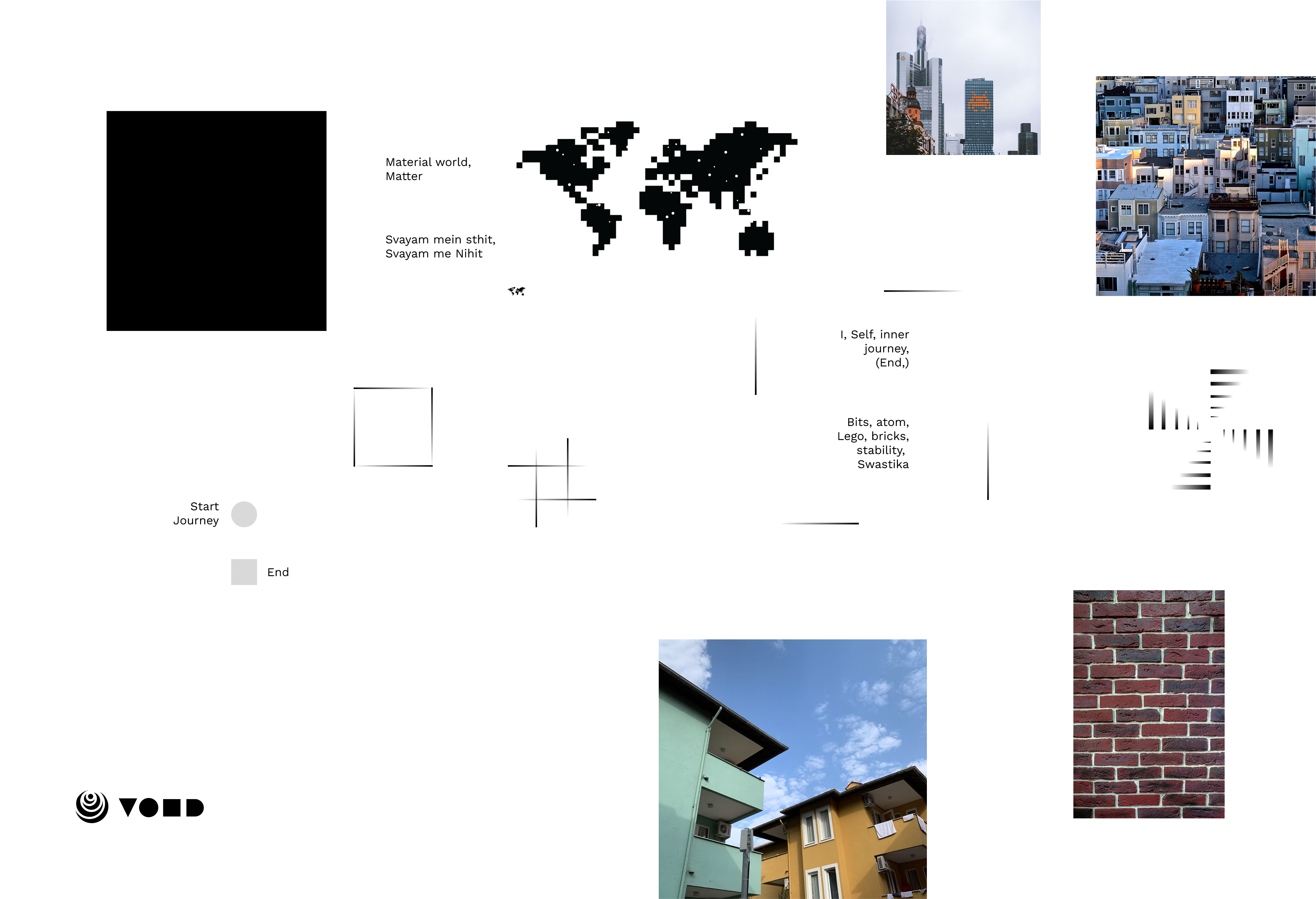
  • I – Signifies the self, stillness, and inner journey—anchored in stability.

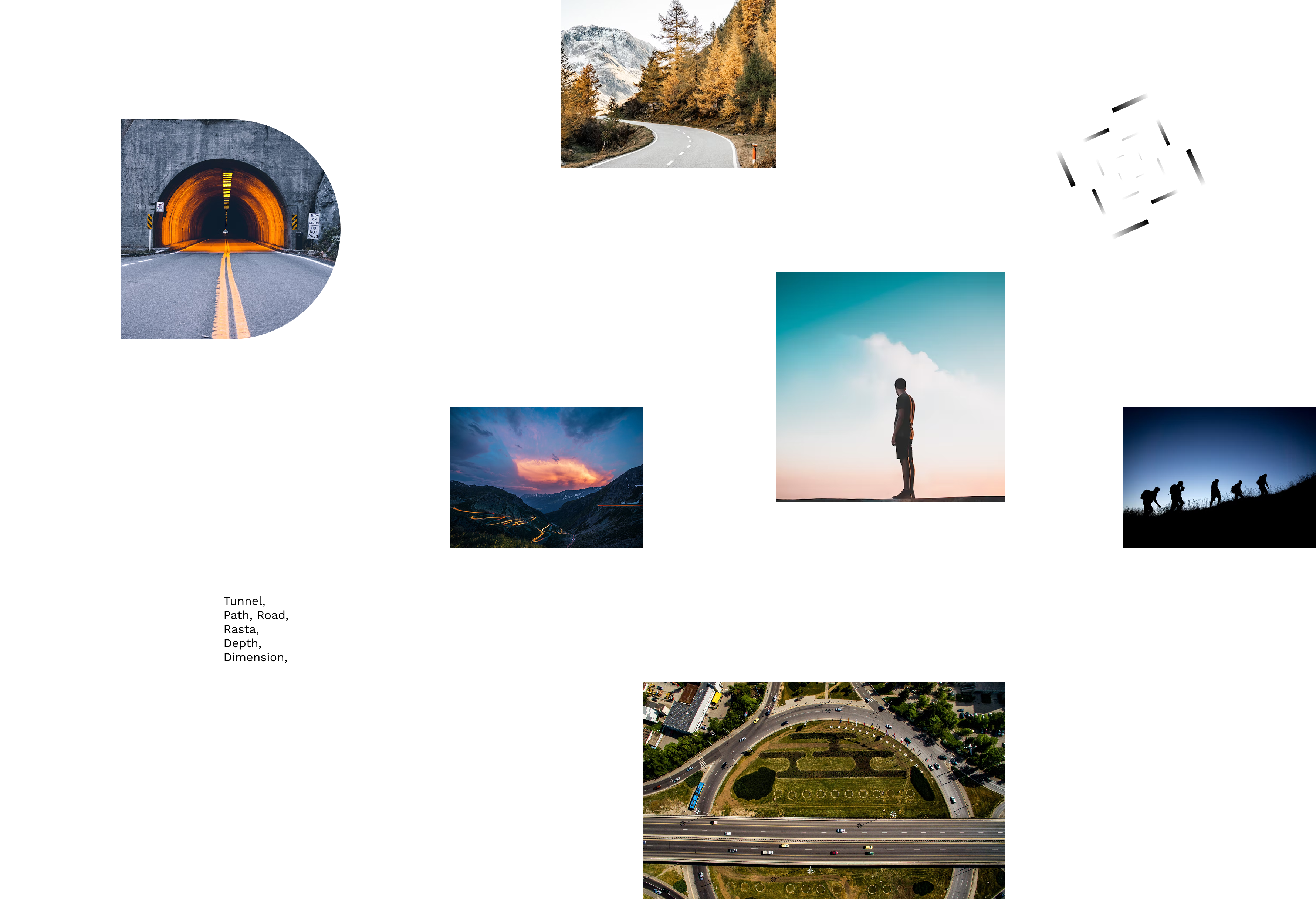
  • D – Embodies the path, depth, and the dimensions of existence.


Core Visual Elements:

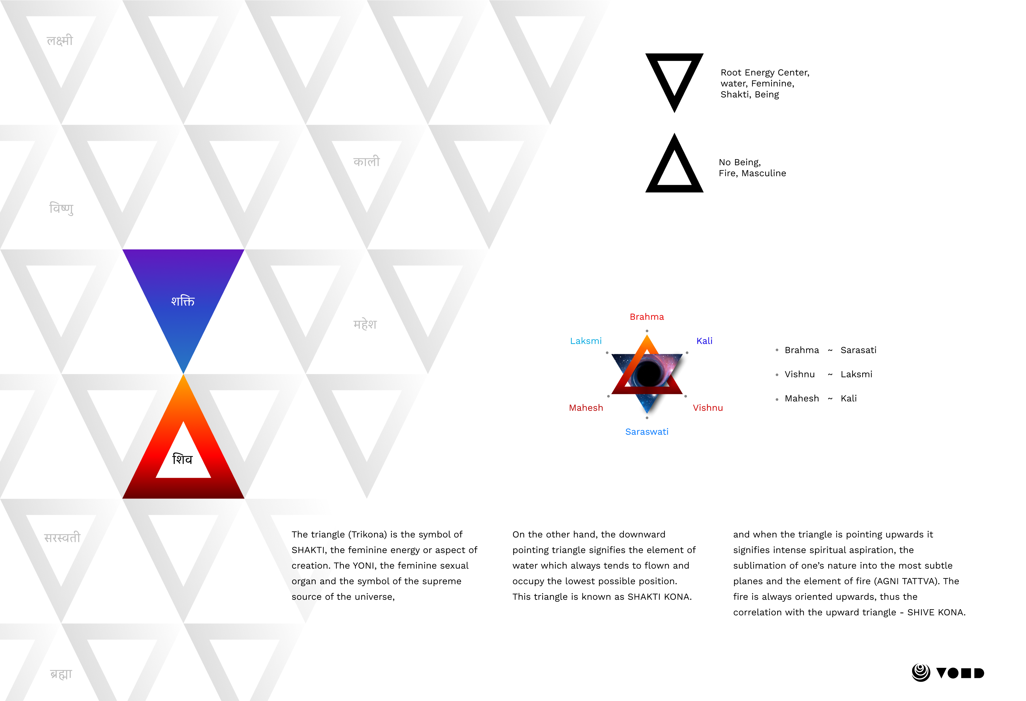
Triangle: The Cosmic Key
  1. Shakti Triangle (Downward): Represents feminine energy, water, and creation.
  2. Shiva Triangle (Upward): Symbolises masculine energy, fire, and spiritual ascension.
  3. V-Shape Integration: Reflects equilibrium, uniting dual forces into a singular expression of cosmic balance.


Minimalism & Negative Space:

  1. Black represents the vastness and mystery of the universe.
  2. Abstract yet recognisable forms evoke a sense of depth and fluidity.
  3. Negative space reinforces the concept of the void, making the design timeless and impactful.


Design Solutions:

        Branding & Identity
  • Developed a modern, trustworthy brand identity.

  • Defined a cohesive visual language reflecting Airveda’s mission.

         Website & SaaS UX/UI

  • Designed a streamlined, responsive website with intuitive navigation.

  • Created an interactive SaaS dashboard featuring real-time data and alerts.

         MOBILE APPlication

  • Crafted an intuitive app for real-time monitoring and alerts.
  • Integrated gamification elements to boost engagement.

         Product & TFT Interface
  • Designed clear, user-friendly TFT displays for Airveda monitors.

  • Prioritised essential metrics and real-time updates.

         Packaging & Media

  • Developed eco-friendly packaging and print materials.

  • Designed digital assets and awareness campaigns.


Impact & Outcomes:

Our software solutions encompass a comprehensive development process:

  • 35% increase in engagement across digital platforms.
  • Higher mobile app adoption due to improved usability.
  • Greater data accessibility, empowering informed decisions.
  • Enhanced brand credibility in air quality innovation.

Conclusion:

Designing Airveda’s ecosystem transformed complex air quality data into an intuitive, actionable experience. This project reaffirmed the power of UX in driving environmental awareness and impact.
Clean air is a right, let’s design for a healthier future.

No items found.

VOID

Merging into Emptiness

LOGO DESIGN CONCEPTUALISATION DIGITAL MEDIA


Concept & Inspiration:

Designed as a visual embodiment of the Space element (Akash)—the essence of existence—the VOID logo captures the balance between form and nothingness. Rooted in cosmic philosophy, it harmonizes feminine and masculine energies, embracing the equilibrium between creation and ascension. The triangle, an ancient symbol of power, serves as the foundation, representing transformation and infinite potential.
Symbolism & Design Breakdown:

Each letter is crafted with intentionality, channeling the essence of emptiness and depth:


  • V – Formed by the negative space between two mountains, symbolizing balance and duality.

  • O – Represents a black hole, infinity, and the boundless nature of space.
  • I – Signifies the self, stillness, and inner journey—anchored in stability.

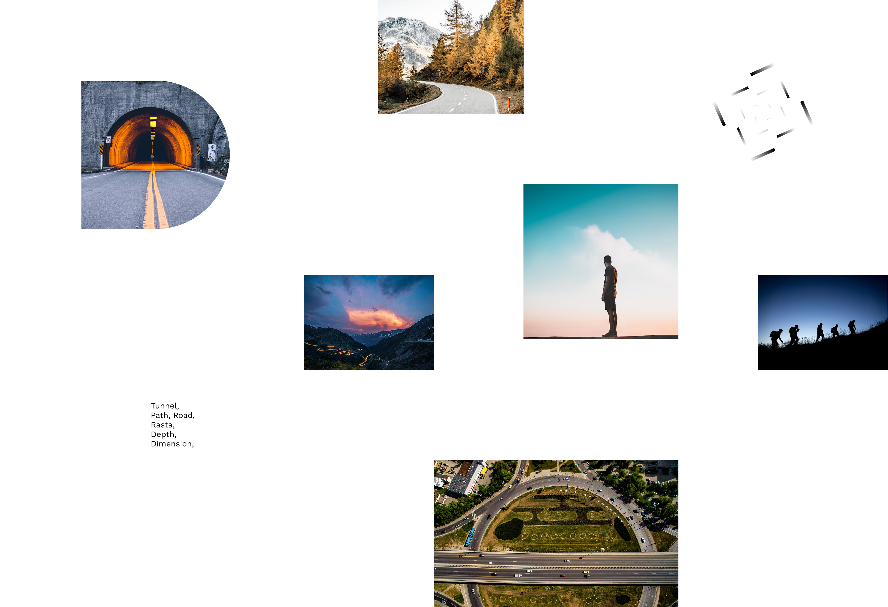
  • D – Embodies the path, depth, and the dimensions of existence.


Core Visual Elements:

Triangle: The Cosmic Key
  1. Shakti Triangle (Downward): Represents feminine energy, water, and creation.
  2. Shiva Triangle (Upward): Symbolises masculine energy, fire, and spiritual ascension.
  3. V-Shape Integration: Reflects equilibrium, uniting dual forces into a singular expression of cosmic balance.


Minimalism & Negative Space:

  1. Black represents the vastness and mystery of the universe.
  2. Abstract yet recognisable forms evoke a sense of depth and fluidity.
  3. Negative space reinforces the concept of the void, making the design timeless and impactful.


Design Process:

  1. 1. Research & Conceptualisation


    Exploring cosmic geometry, sacred symbolism, and elemental philosophy to define a visual language of emptiness and limitlessness.


  2. Sketching & Refinement


    Experimenting with triangles, negative space, and letterforms to craft a balanced yet striking composition.


  3. 3. Digital Iteration


    Fine-tuning proportions, typography, and spatial dynamics for clarity and symbolic depth across all platforms.


Impact & Brand Significance:

  1. Memorability: A minimalist yet profound identity that leaves a lasting impression.
  2. Emotional Connection: Invokes peace, stability, and cosmic alignment.
  3. Versatility: Adaptable across digital and print mediums with seamless scalability.


Conclusion:

The VOID logo is a visual meditation on the infinite, the interplay of forces, and the essence of space. More than a design, it’s an invitation into the void—where everything begins and everything returns.


No items found.

VOID

Merging into Emptiness

CONCEPTUALISATION
UX-UI DESIGN
PRODUCT DESIGN


Concept & Inspiration:

Designed as a visual embodiment of the Space element (Akash)—the essence of existence—the VOID logo captures the balance between form and nothingness. Rooted in cosmic philosophy, it harmonizes feminine and masculine energies, embracing the equilibrium between creation and ascension. The triangle, an ancient symbol of power, serves as the foundation, representing transformation and infinite potential.
Symbolism & Design Breakdown:

Each letter is crafted with intentionality, channeling the essence of emptiness and depth:


  • V – Formed by the negative space between two mountains, symbolizing balance and duality.

  • O – Represents a black hole, infinity, and the boundless nature of space.
  • I – Signifies the self, stillness, and inner journey—anchored in stability.

  • D – Embodies the path, depth, and the dimensions of existence.


Core Visual Elements:

Triangle: The Cosmic Key
  1. Shakti Triangle (Downward): Represents feminine energy, water, and creation.
  2. Shiva Triangle (Upward): Symbolises masculine energy, fire, and spiritual ascension.
  3. V-Shape Integration: Reflects equilibrium, uniting dual forces into a singular expression of cosmic balance.


Minimalism & Negative Space:

  1. Black represents the vastness and mystery of the universe.
  2. Abstract yet recognisable forms evoke a sense of depth and fluidity.
  3. Negative space reinforces the concept of the void, making the design timeless and impactful.


Design Approach:

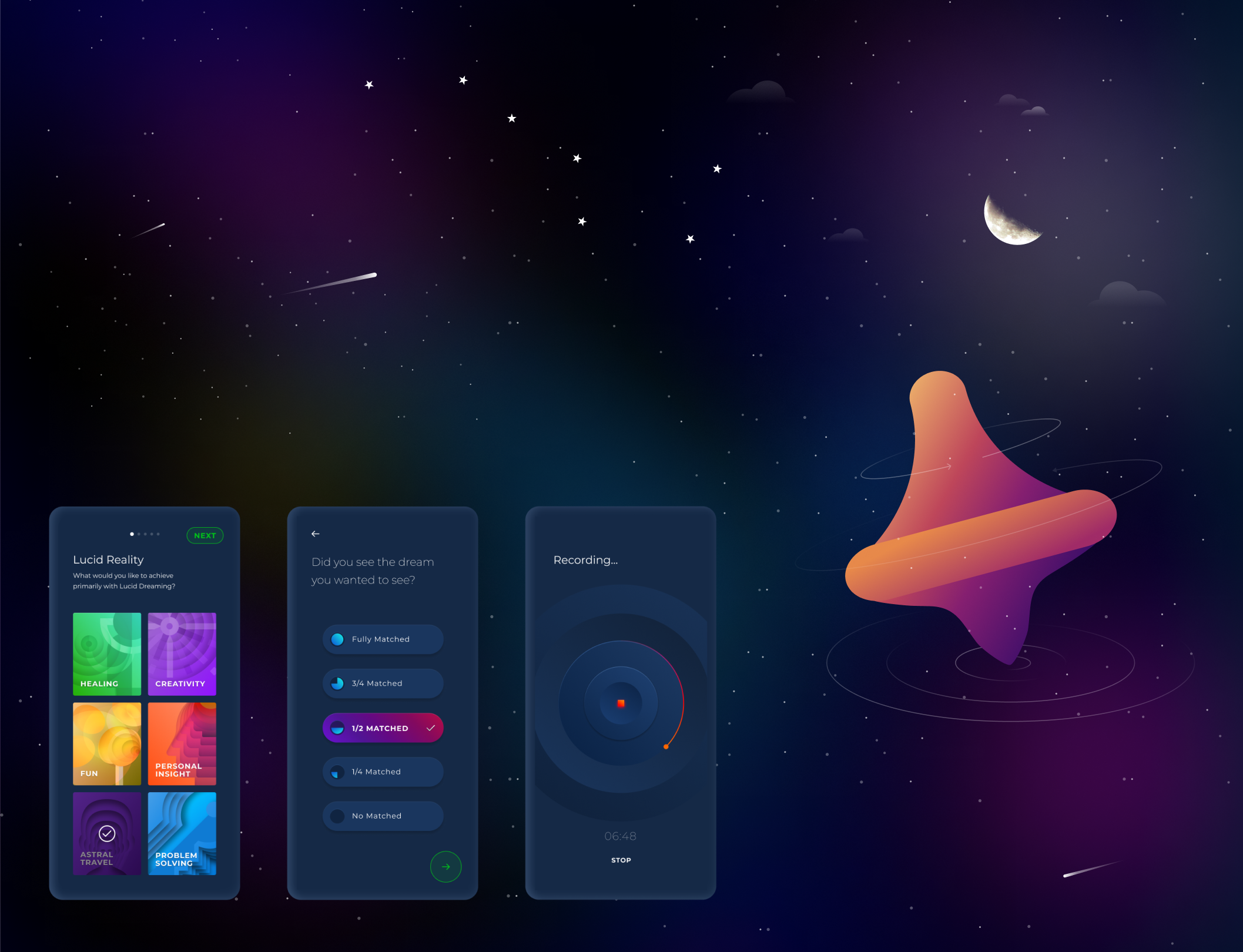
The design aimed to bridge the gap between scientific understanding of sleep and spiritual interpretations of consciousness. The application leverages classical conditioning principles for effective reality checks and incorporates a visually harmonious design inspired by the chakra system to enhance the user experience.


User Benefits:

Potential benefits include nightmare control, enhanced mental and emotional well-being, boosted creativity, skill rehearsal, increased self-awareness, personal growth, and unique dream experiences.


Conclusion:

Lucid Reality offers a unique and accessible pathway to explore the depths of consciousness and harness the transformative power of lucid dreams by thoughtfully integrating science and spirituality in its design and functionality.

Lucid Reality isn’t just an app, it’s a gateway to unlocking cognitive potential through dreams.
No items found.

VOID

Merging into Emptiness

WEBSITE DESIGN
MOBILE APP DESIGN

SAAS PLATFORMS


Concept & Inspiration:

Designed as a visual embodiment of the Space element (Akash)—the essence of existence—the VOID logo captures the balance between form and nothingness. Rooted in cosmic philosophy, it harmonizes feminine and masculine energies, embracing the equilibrium between creation and ascension. The triangle, an ancient symbol of power, serves as the foundation, representing transformation and infinite potential.
Symbolism & Design Breakdown:

Each letter is crafted with intentionality, channeling the essence of emptiness and depth:


  • V – Formed by the negative space between two mountains, symbolizing balance and duality.

  • O – Represents a black hole, infinity, and the boundless nature of space.
  • I – Signifies the self, stillness, and inner journey—anchored in stability.

  • D – Embodies the path, depth, and the dimensions of existence.


Core Visual Elements:

Triangle: The Cosmic Key
  1. Shakti Triangle (Downward): Represents feminine energy, water, and creation.
  2. Shiva Triangle (Upward): Symbolises masculine energy, fire, and spiritual ascension.
  3. V-Shape Integration: Reflects equilibrium, uniting dual forces into a singular expression of cosmic balance.


Minimalism & Negative Space:

  1. Black represents the vastness and mystery of the universe.
  2. Abstract yet recognisable forms evoke a sense of depth and fluidity.
  3. Negative space reinforces the concept of the void, making the design timeless and impactful.


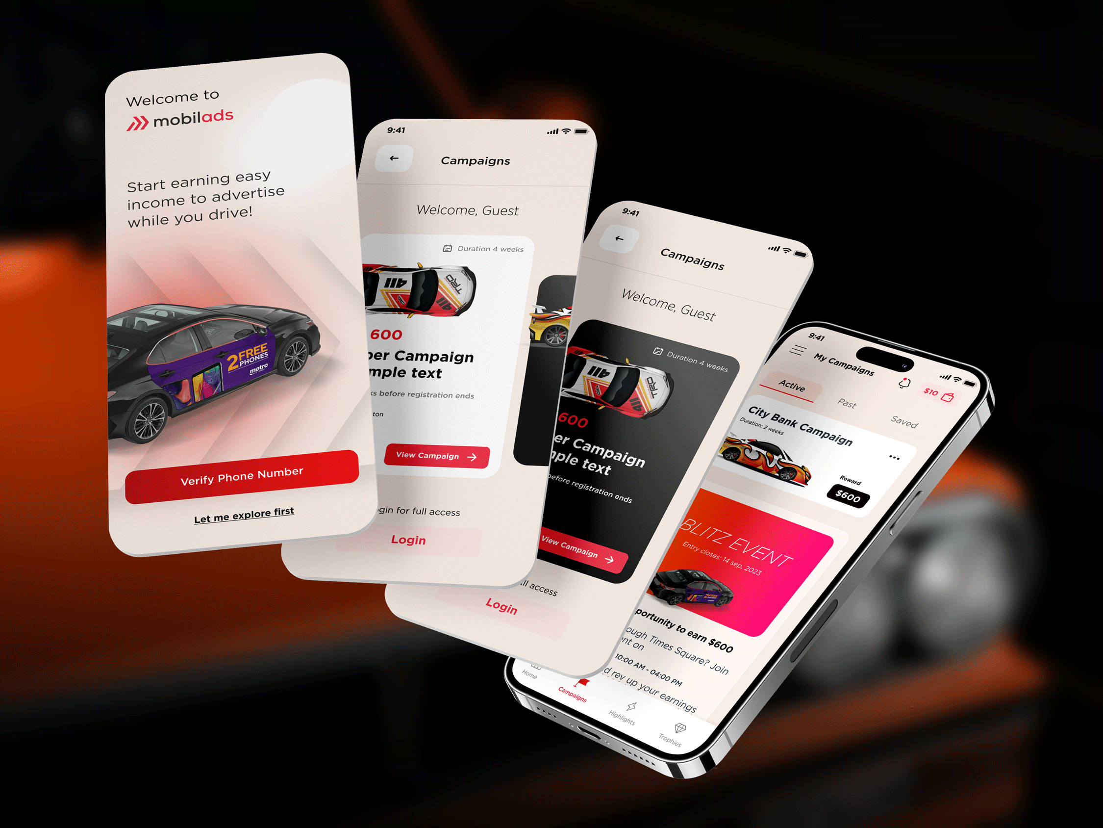
Design Solutions:

        Smooth Onboarding
  • Guided sign-up – Bite-sized steps for effortless registration.

  • Instant verification – Real-time document scanning for quick approvals.


         Smart Campaign Discovery
  • Location-based search – Interactive map and list view for easy browsing.

  • AI-driven recommendations – Personalised campaigns based on driving history.

         Hassle-Free Wrap Installation

  • One-tap scheduling – Simplified booking for wrap installations.
  • Live updates – Push notifications for reminders and confirmations.

         Transparent Earnings Dashboard
  • Real-time tracking – Clear, visual breakdown of earnings.
  • One-tap payouts – Instant withdrawals, no delays.


Key Ui-Ux Wins:

Our software solutions encompass a comprehensive development process:

  • 40% faster onboarding more drivers signed up in record time.
  • 30% boost in campaign participation Smarter discovery led to higher engagement.
  • 25% fewer drop-offs Clearer installation guidance kept drivers on track.
  • 4.8/5 driver satisfaction A seamless experience made all the difference.


Impact & Outcomes:

Our software solutions encompass a comprehensive development process:

  • 50% spike in app engagement more drivers, more earnings.
  • 35% increase in payouts transparency led to trust.
  • Higher retention a frictionless process kept drivers coming back.
  • Brand glow-up Mobilads became the go-to for passive income on the road.


Conclusion:

With a sleek new UX, Mobilads turned driving into dollars, no extra effort needed. |
A streamlined sign-up, smarter campaign discovery, and crystal-clear earnings dashboard put drivers in the fast lane to extra cash.


What’s Next?

  • Gamification rewards for long-term participation.
  • AI-powered campaign matching maximise earnings effortlessly.
  • Expansion bringing Mobilads to more cities.

Mobilads isn’t just an app it’s a movement. And we’re just getting started.

No items found.